– NPD New branded product development – Eyecatching refreshing can design – Story-led tropical design expression – Premium lifestyle feeling execution
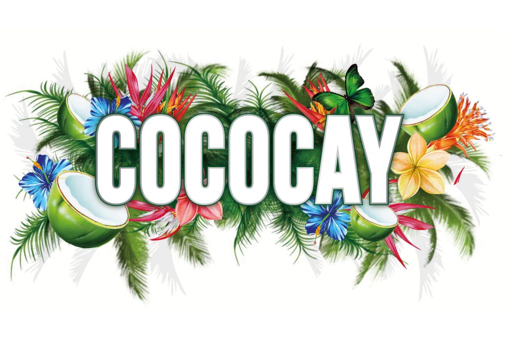
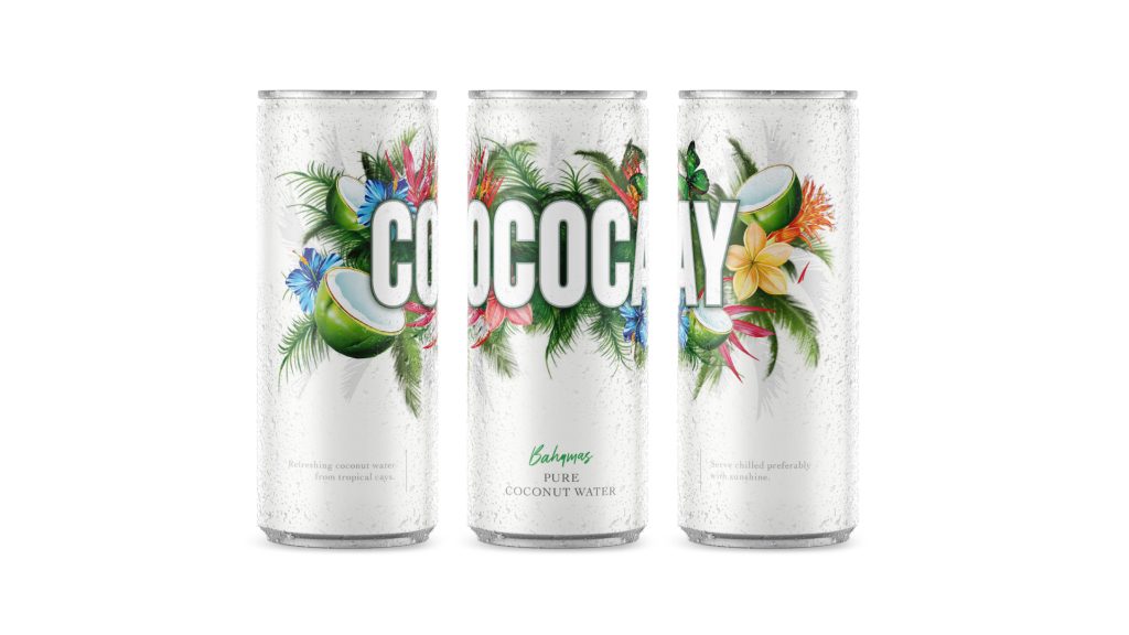
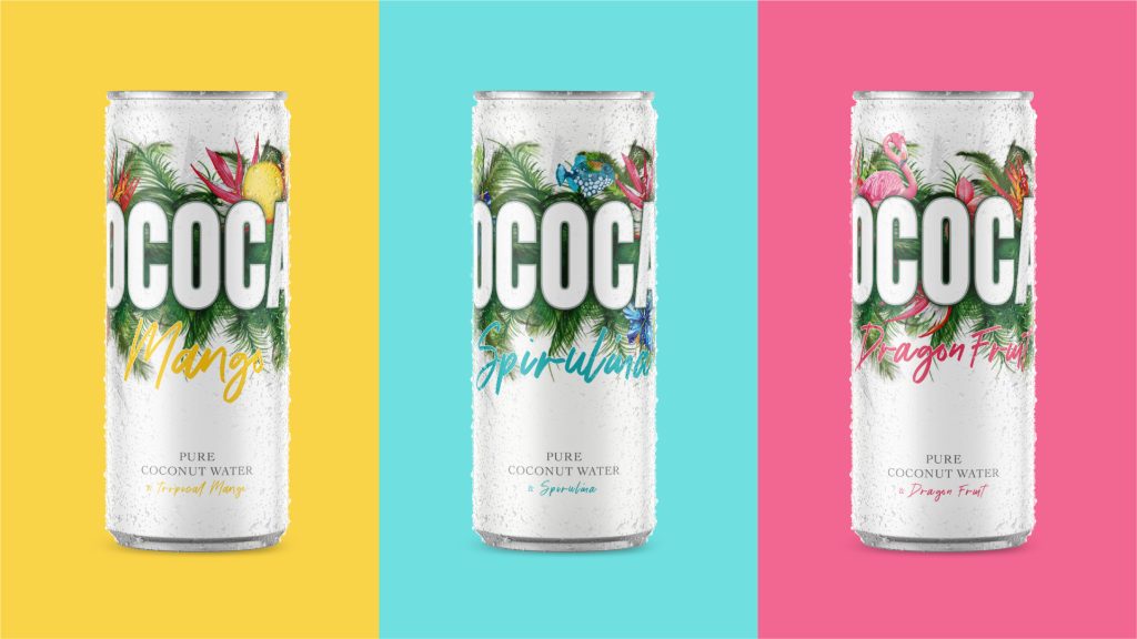
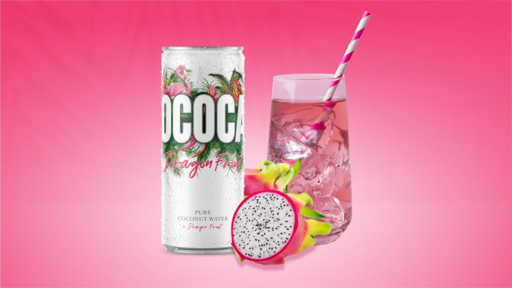
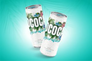
Cococay is a premium canned coconut water concept. A range consisting of a natural variant and range of interesting flavours such as Spirulina and Dragon fruit.
The packaging design is conceived to have a refreshing, contemporary and tropical feel and be very impactful on busy shelves. The white and palm leaves immediately suggest tropical coconut water and with green coconut illustrations is a consistent base across all the range.
Colours, flowers and product specific fruits are used to differentiate between flavours and there are a few quirky elements of discovery within the palms that are fun and engaging.
The main typography is big and bold, uniquely running around the can so that it invites you to pick up and discover it and offers impactful block building on shelf.
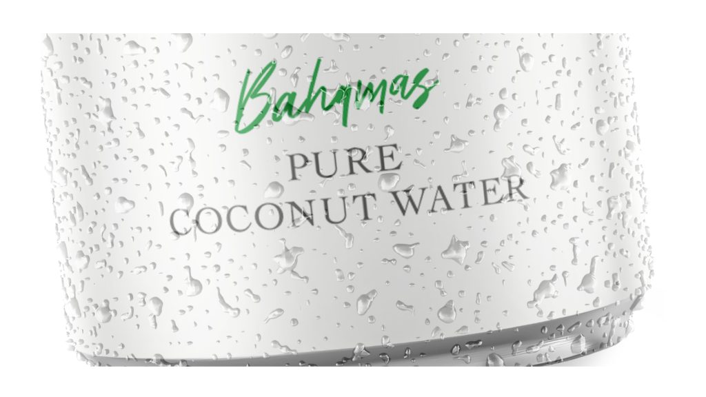
Support type is colour coded and with an approachable feel and details enhance the quality feel of the design and brand identity.
Slimline cans offer a contemporary elegant feel and matching coloured ring pulls help harmonise the designs and aid product navigation.
| Elevating the premium feel with considered typography.
| Additional elements and colour palette for flavour variants.
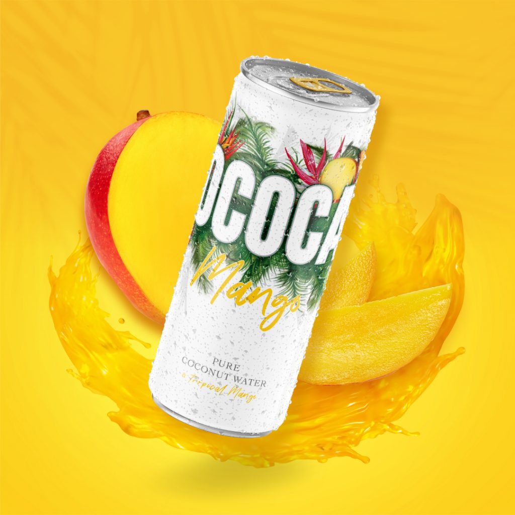
Cococay is a premium canned coconut water concept. A range consisting of a natural variant and range of interesting flavours such as Spirulina and Dragon fruit.
The packaging design is conceived to have a refreshing, contemporary and tropical feel and be very impactful on busy shelves. The white and palm leaves immediately suggest tropical coconut water and with green coconut illustrations is a consistent base across all the range.
Colours, flowers and product specific fruits are used to differentiate between flavours and there are a few quirky elements of discovery within the palms that are fun and engaging.
The main typography is big and bold, uniquely running around the can so that it invites you to pick up and discover it and offers impactful block building on shelf.
Support type is colour coded and with an approachable feel and details enhance the quality feel of the design and brand identity.
Slimline cans offer a contemporary elegant feel and matching coloured ring pulls help harmonise the designs and aid product navigation.
| Bright and impactful still life image
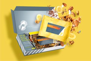
| Bringing the product to life with movement and ingredients.