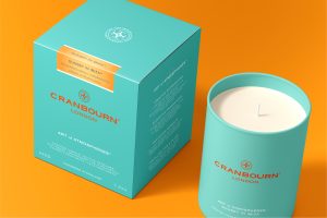
– Individual corporate identity within group of companies – Distinguished colours and vibrant palette – Corporate communications – Expression of provenance
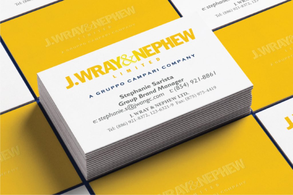
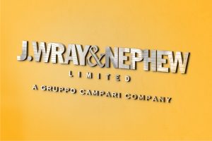
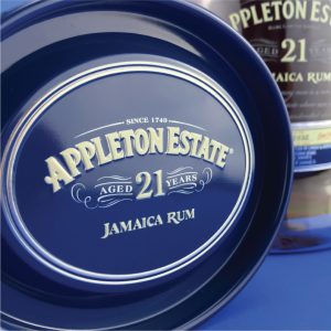
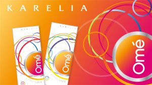
When Wray & Nephew were incorporated into Gruppo Campari and needed a logo the challenge to me was clear – How to retain a company’s identity when part of something bigger?
The solution for me lied with authenticity – the inspiration had to come from a genuine source that would inspire ideas giving a very personal, individual feel within a much bigger corporate environment. The start point with the final idea was essentially sunshine – symbolic of sunny days and the warmth of spirit that radiates from the Jamaican people.
The boldness of the typography and the letter spacing lent itself to being filled with pattern and the rays were one of a selection of ideas, keeping the logo lively and very distinctive.
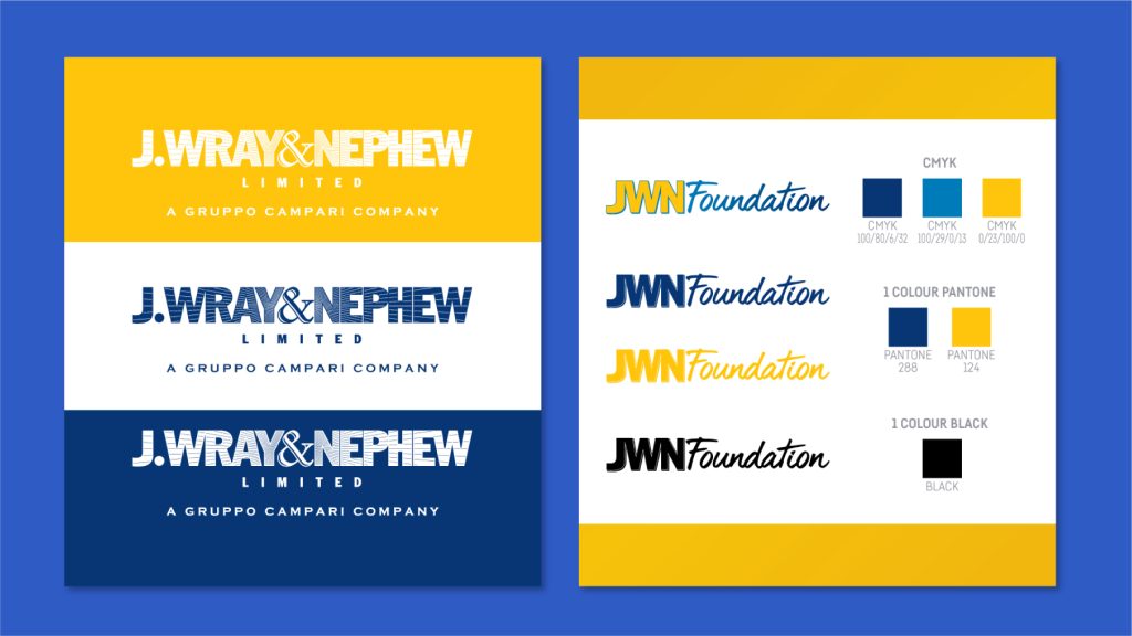
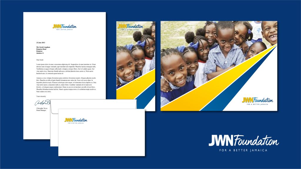
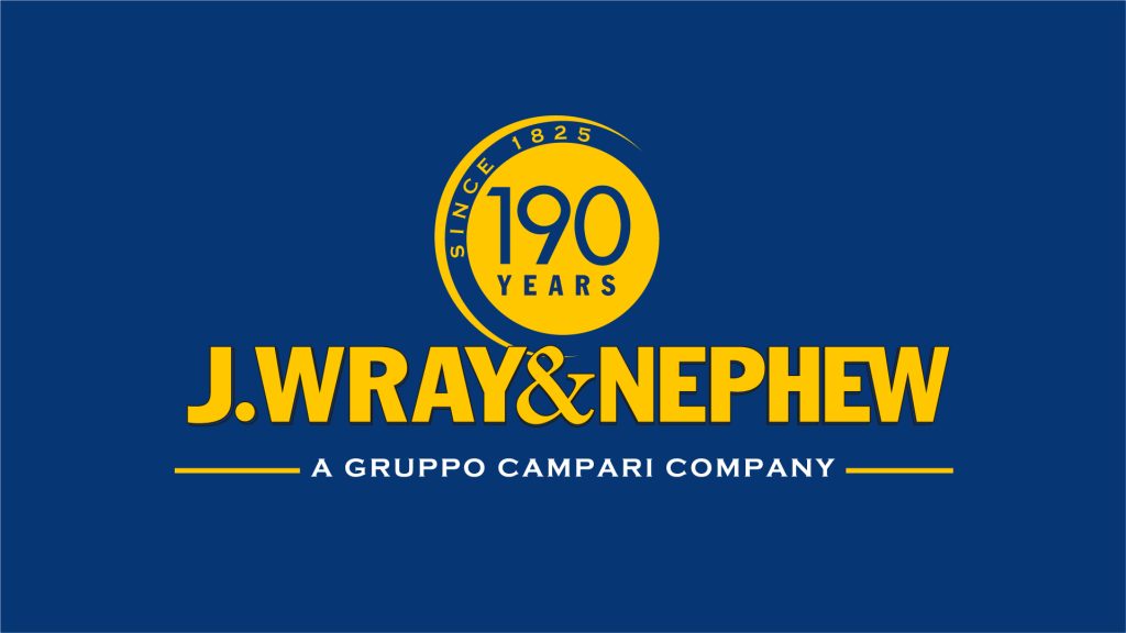
The style was versatile enough to be able to be used for a whole group of companies within the portfolio retaining each one as part of a bigger family.
The logo was abbreviated and with additions became the logo for many other corporate partnerships.
| Variations of the logo and identity across different innitiatives.
When Wray & Nephew were incorporated into Gruppo Campari and needed a logo the challenge to me was clear – How to retain a company’s identity when part of something bigger?
The solution for me lied with authenticity – the inspiration had to come from a genuine source that would inspire ideas giving a very personal, individual feel within a much bigger corporate environment. The start point with the final idea was essentially sunshine – symbolic of sunny days and the warmth of spirit that radiates from the Jamaican people.
The boldness of the typography and the letter spacing lent itself to being filled with pattern and the rays were one of a selection of ideas, keeping the logo lively and very distinctive.
The style was versatile enough to be able to be used for a whole group of companies within the portfolio retaining each one as part of a bigger family.
The logo was abbreviated and with additions became the logo for many other corporate partnerships.