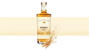
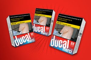
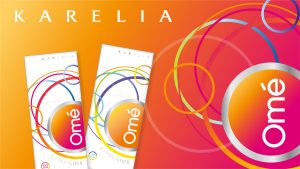
– NPD New branded product development – Label design – Story-led design expression – Quality finishes and unique crafting
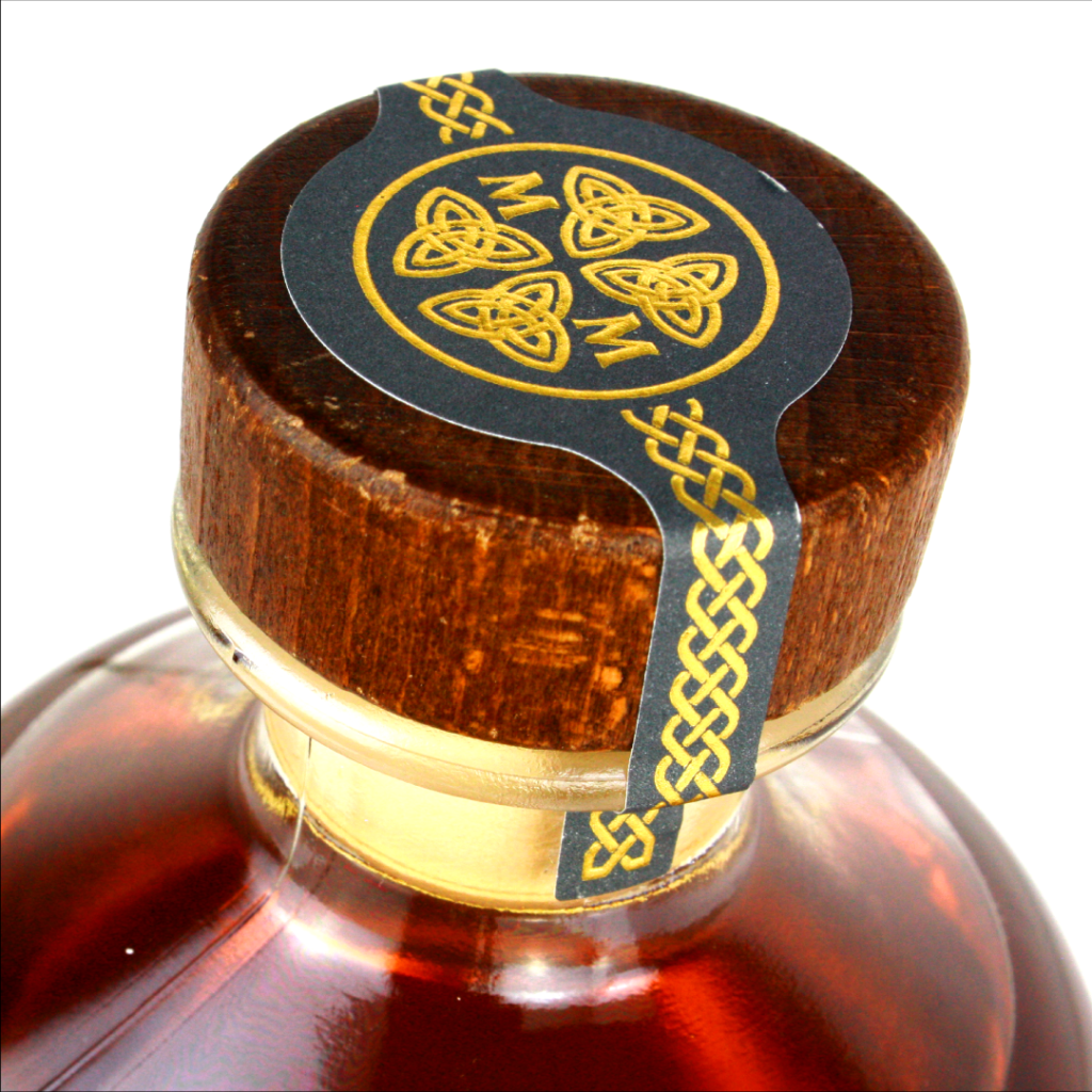
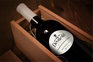
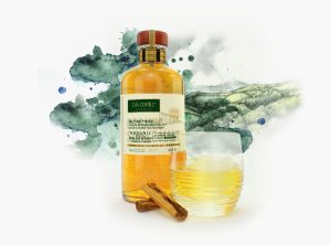
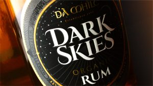
In celebration of Wales’ International Dark Sky Park, local organic sprit producers Dà Mhìle, created Dark Skies Organic Rum, a project that was to bring the experience and the enveloping discovery of the night skies to a label.
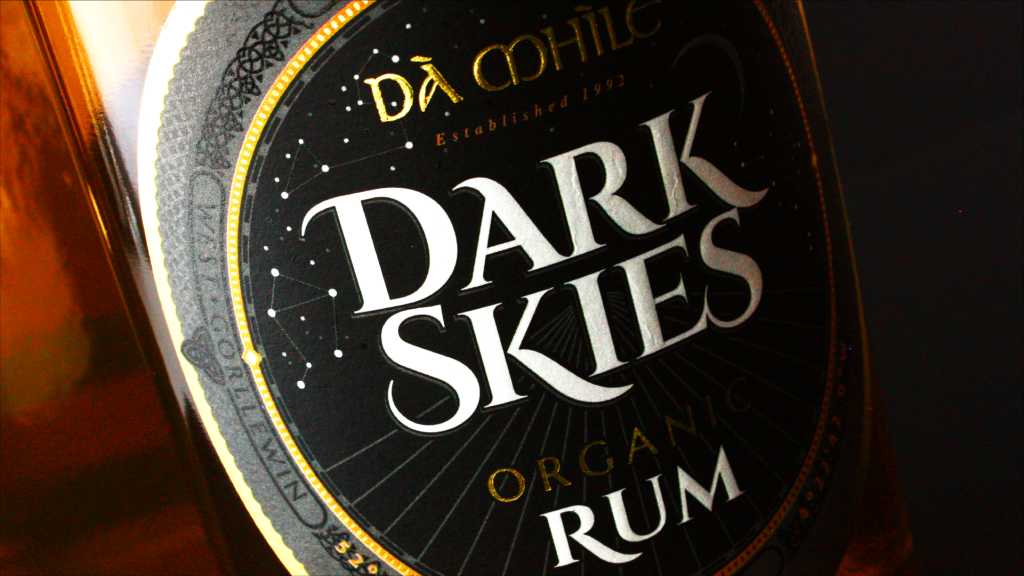
The overarching theme of the design was the exploration of darkness.
Playing with the theme we selected finishes to bring the idea to life. By using varnishes, details appear to move in and out of the night as they catch the light and invite you to discover constellations (matching the producers own star signs) in the night sky and the intricate patterns of Celtic design.
A delicate balance between black and dark slate grey maintains mystery but brings depth to the label, and embossing and varnishes to the white areas accentuate the logo, which appears reminiscent of the moon in the depths of night.
The textured stock helps convey the organic nature of the product and amplifying the radiance of the intricate gold areas that seemingly sparkle as they catch the light and compliment the rich colours of the rum.
| Dark rum label with delicate gold detail that catches the light.
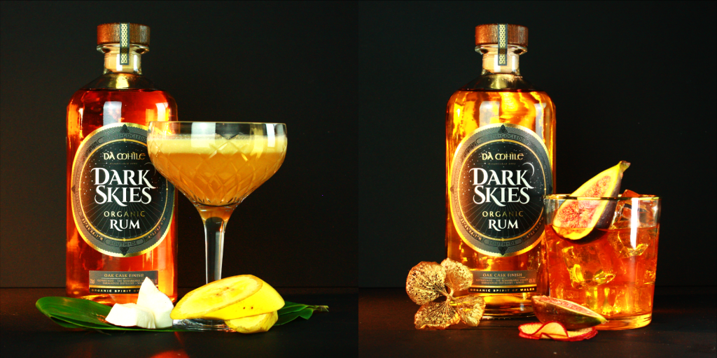
| Perfect serve cocktail photographs and styling.
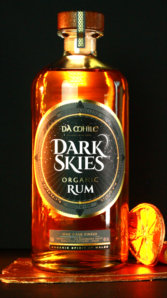
| Gold styling to enhance the product and the label design details.
In celebration of Wales’ International Dark Sky Park, local organic sprit producers Dà Mhìle, created Dark Skies Organic Rum, a project that was to bring the experience and the enveloping discovery of the night skies to a label.
The overarching theme of the design was the exploration of darkness.
Playing with the theme we selected finishes to bring the idea to life. By using varnishes, details appear to move in and out of the night as they catch the light and invite you to discover constellations (matching the producers own star signs) in the night sky and the intricate patterns of Celtic design.
A delicate balance between black and dark slate grey maintains mystery but brings depth to the label, and embossing and varnishes to the white areas accentuate the logo, which appears reminiscent of the moon in the depths of night.
The textured stock helps convey the organic nature of the product and amplifying the radiance of the intricate gold areas that seemingly sparkle as they catch the light and compliment the rich colours of the rum.
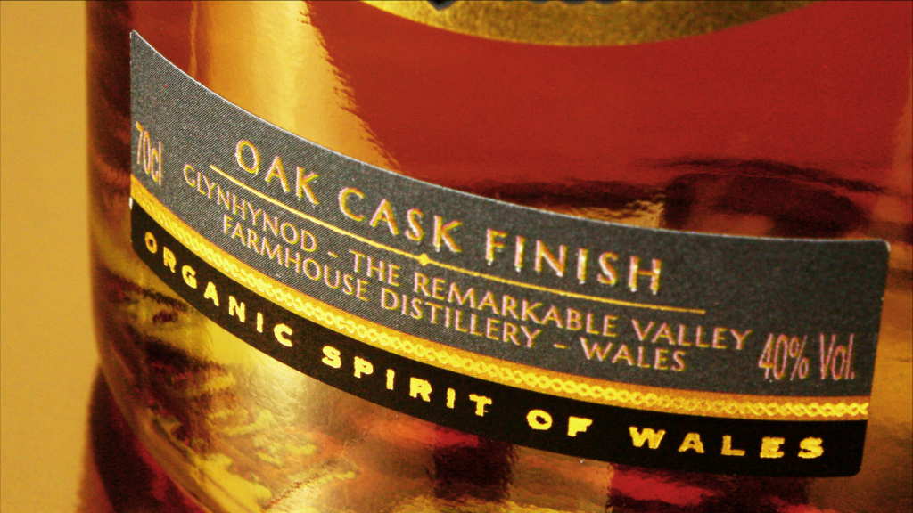
| Lower label with delicate design crated details.
| Over the stopper label in contemporary grey with gold Celtic detailing.