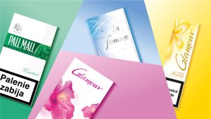
– Brand and corporate identity – Contemporary luxury lifestyle aesthetic – Refined typography and communications – Colour palette and brand guidelines
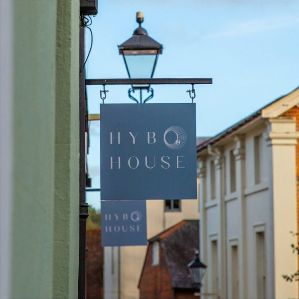
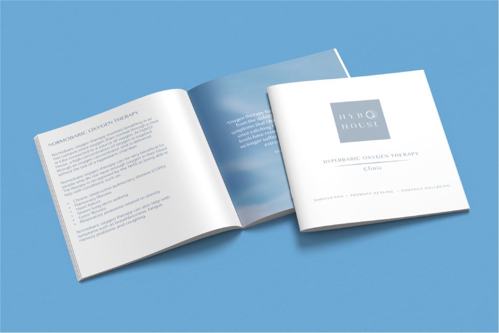
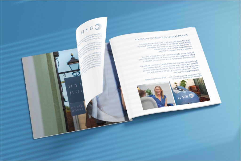
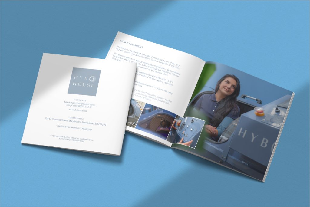
Hyperbaric Oxygen Therapy has become a very fashionable and effective treatment for anything from temporary revitalisation to speeding up injury repair. The product is not cheap and a brand built around such a scientific service required specialist branding skills that frame the process to appeal to a luxury lifestyle evangelist and those able to afford alternative therapy treatments.
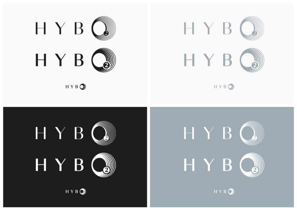
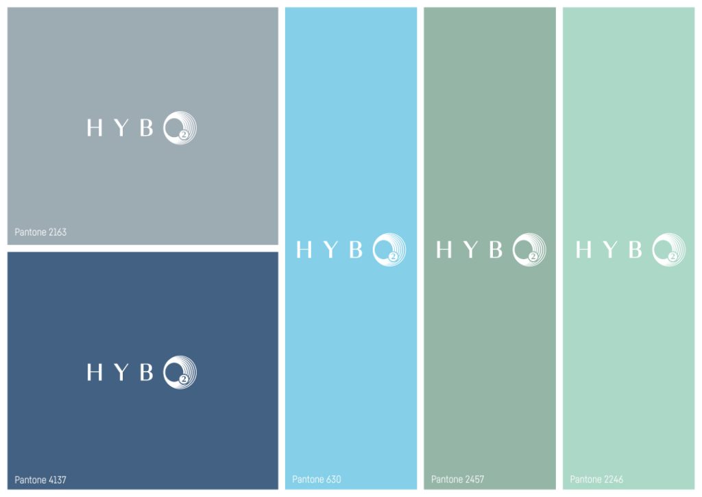
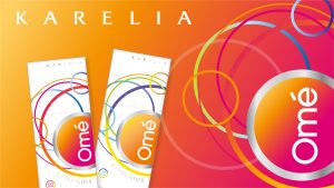
The branding is a mix of a simple clean and ‘oxygenating’ blue teamed with a premium silver logo that felt both trustworthy and in keeping with a luxury lifestyle. The typography taps into fashion editorial design and the unique O is designed to represent both the oxygen chambers and the emanating energy from the therapy.
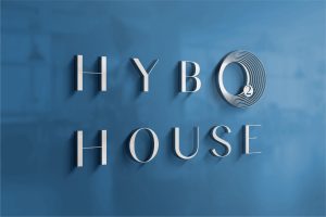
Identity guidelines were created to launch the brand design and create a cohesive feel for all touch points including the chambers that were made in branded colours. Usage of the logo, complementary colours, and typography were included to create a cohesive identity.
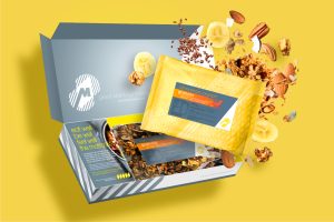
| Branded graphics communications in brand colours.
| Consistent appeal using brand identity guidelines.
Hyperbaric Oxygen Therapy has become a very fashionable and effective treatment for anything from temporary revitalisation to speeding up injury repair. The product is not cheap and a brand built around such a scientific service required specialist branding skills that frame the process to appeal to a luxury lifestyle evangelist and those able to afford alternative therapy treatments.
The branding is a mix of a simple clean and ‘oxygenating’ blue teamed with a premium silver logo that felt both trustworthy and in keeping with a luxury lifestyle. The typography taps into fashion editorial design and the unique O is designed to represent both the oxygen chambers and the emanating energy from the therapy.
Identity guidelines were created to launch the brand design and create a cohesive feel for all touch points including the chambers that were made in branded colours. Usage of the logo, complementary colours, and typography were included to create a cohesive identity.