– Brand evolution and packaging upgrade – Label design and illustrations – Story-led design expression – Quality finishes and evocative crafting
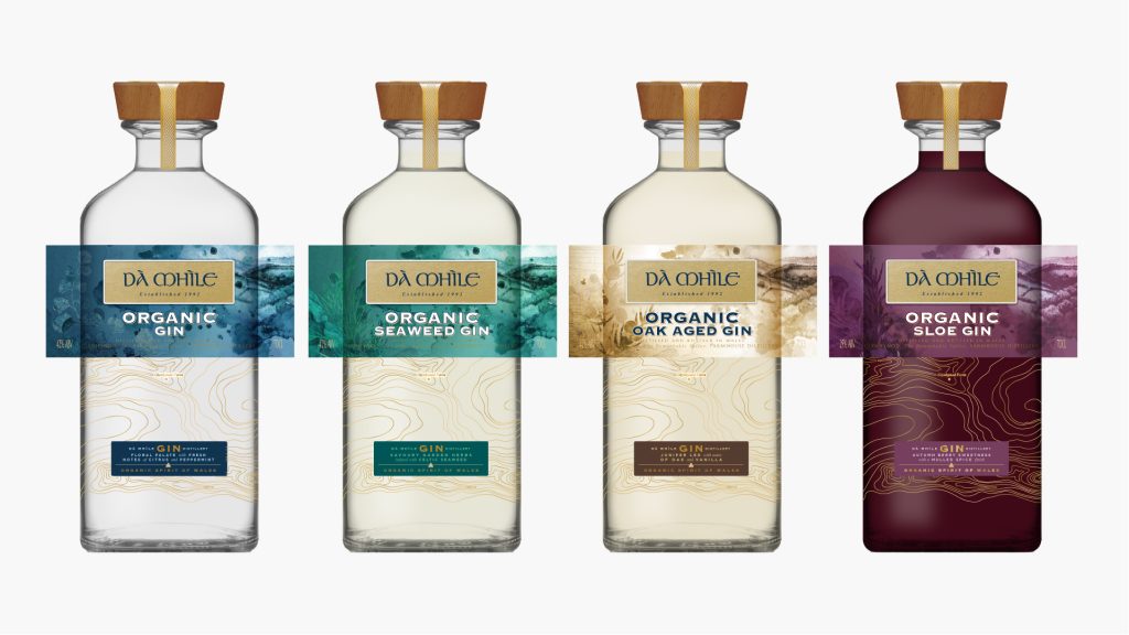
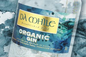
This brand redesign for Dà Mhìle spirits was an opportunity to tell the story of organic spirits from Wales by conveying the qualities of its origin, Celtic crafting, and the unique relationship between land and location.
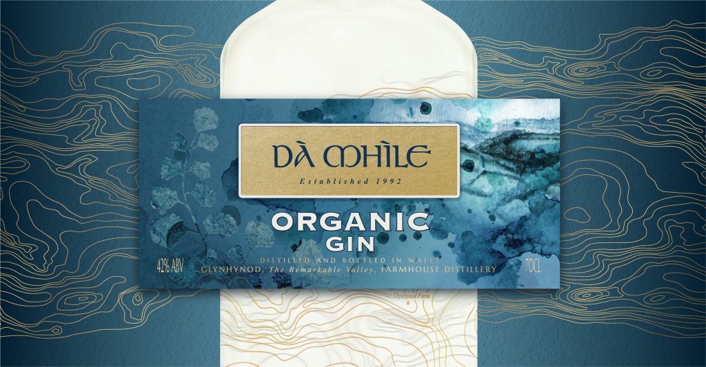
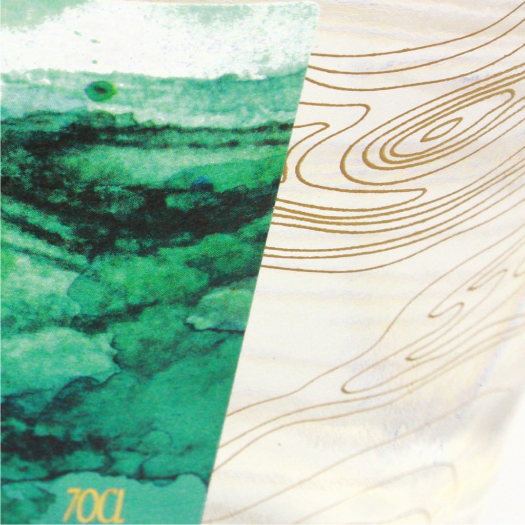
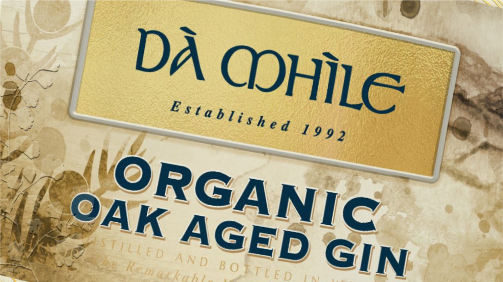
The label design was designed to be consistent across a range and infinitely adaptable to new varieties in the future. Using a Welsh gold coloured brand panel puts this design specifically in the premium spirits category and creates shelf appeal. Using elegant screening on the bottle I created a pattern based on the typographical geography of the land and the pattern of wood grain
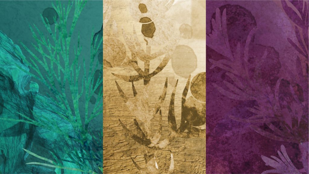
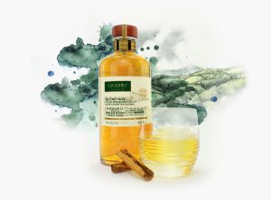
I wanted to use a landscape scene that was a view from the farmhouse to give it a firm sense of place and to evoke the feeling of the rural weather commissioned it to be illustrated in watercolours that help convey the sense of moving water and rain. Mingled with the watercolour illustration are the botanicals used in each of the gins so each becomes a unique representation of that gin.
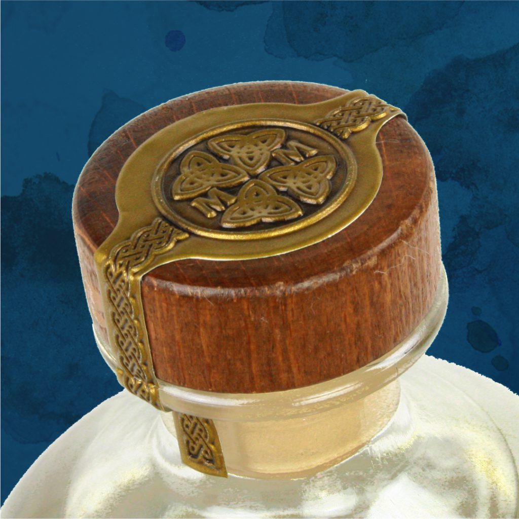
Having Welsh copy on the label helps to convey the unique provenance of the gins, and translations in English help convey the story to a wider audience. Steering clear of overtly Celtic symbolism I crafted subtle details to enhance the packaging presentation that evoke Welsh craft.
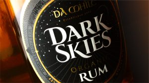
| Illustration both on the label and screen on the bottle.
| Cap and over seal, premium detail finishing.
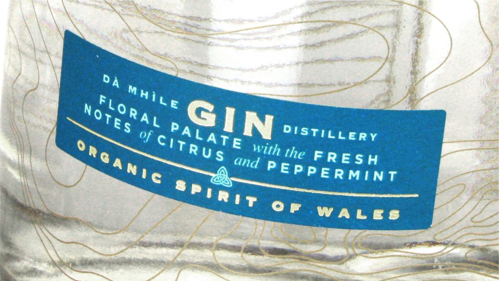
| Lower label with tasting notes and quality gold detail.
This brand redesign for Dà Mhìle spirits was an opportunity to tell the story of organic spirits from Wales by conveying the qualities of its origin, Celtic crafting, and the unique relationship between land and location.
The label design was designed to be consistent across a range and infinitely adaptable to new varieties in the future. Using a Welsh gold coloured brand panel puts this design specifically in the premium spirits category and creates shelf appeal. Using elegant screening on the bottle I created a pattern based on the typographical geography of the land and the pattern of wood grain
I wanted to use a landscape scene that was a view from the farmhouse to give it a firm sense of place and to evoke the feeling of the rural weather commissioned it to be illustrated in watercolours that help convey the sense of moving water and rain. Mingled with the watercolour illustration are the botanicals used in each of the gins so each becomes a unique representation of that gin.
Having Welsh copy on the label helps to convey the unique provenance of the gins, and translations in English help convey the story to a wider audience. Steering clear of overtly Celtic symbolism I crafted subtle details to enhance the packaging presentation that evoke Welsh craft.
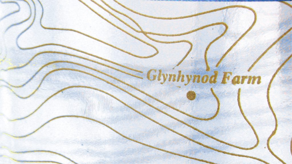
| Topographic stylised lines and farmhouse location suggestion.
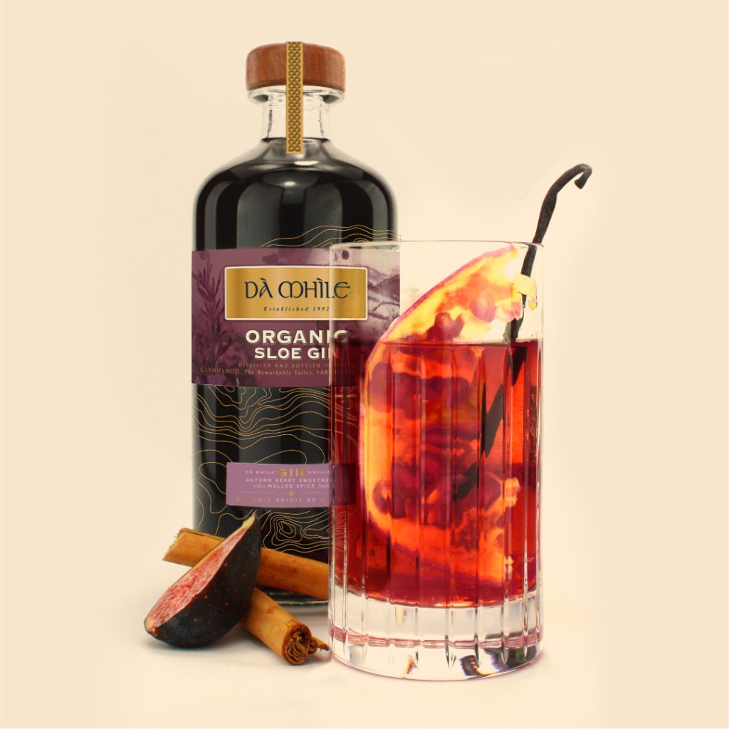
| Range of gins photographed and styled with botanicals and serving suggestions.
| Story-telling through illustration and graphics.
| Sloe Gin with perfect serve and botanicals.
| Colour variation for Oak-Aged expression.
| Illustrated botanicals hidden in the evocative watercolour illustration.