– Global corporate identity rebrand – Group and group companies’ navigation design system – Infinite expansion capability – Creating a ‘people-centric’ business identity
Going ‘Beyond’ both literally as the newly appointed group name, and as an expression for services that exceed client expectation meant the brief for the rebrand was as strategic as it was creative.
Beyond Analysis had become much bigger than just analysis and evolving the brand identity was an opportunity to communicate their growth and aspirations and to appeal to specific audiences in a dynamic and fast paced industry. Inspired by the enthusiasm from the team for their work and continued action towards betterment, ‘Infinity’ became the creative idea that shaped the brand identity.
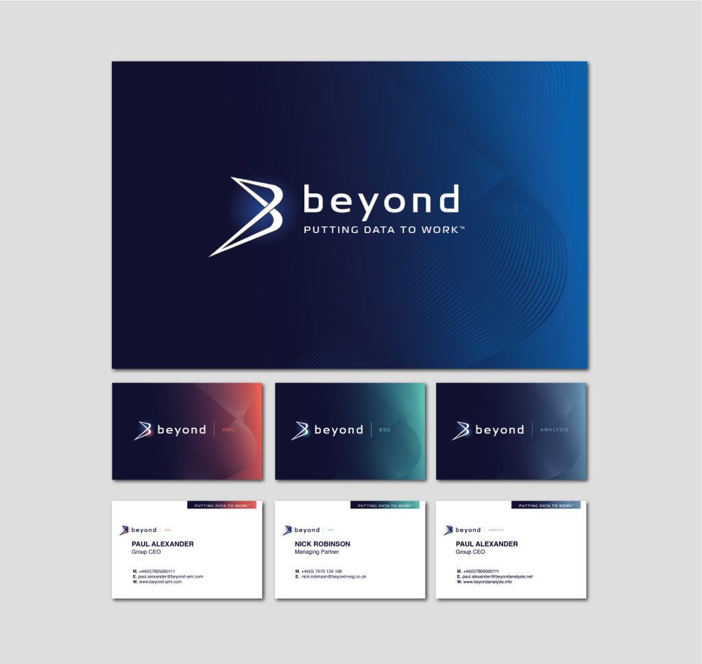
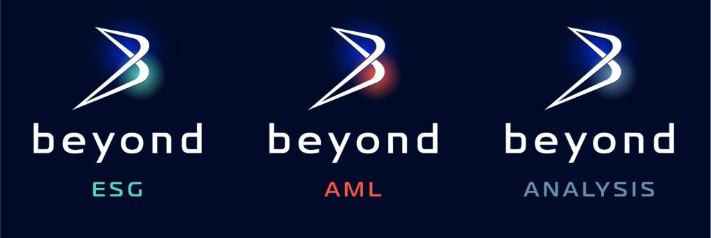
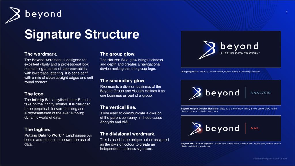
The symbolic Infinity ‘B’ brandmark – is a dynamically stylised letter ‘B’ that plays on its similarity to the infinity symbol and its representation of limitlessness, the perfect embodiment of Beyond’s endless strive to better businesses. The wordmark has been evolved to reflect the companies’ people-centric expertise, becoming more sophisticated but no less approachable by retaining its lowercase familiarity.
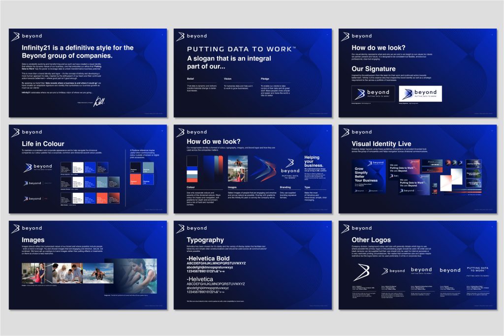
We tweaked the already established company colour palette and chose to look at how we could use the colours differently. We assigned the enriched deep blue as the group corporate colour, using the electric blue to bring depth and contrast. Divisions of the Beyond Group have been given their own accent colour to differentiate the services.
A vertical line serves as a metaphor for division of the group and by adapting the visual hierarchy of words by introducing the company division accent colour we created a flexible and infinite signature system.
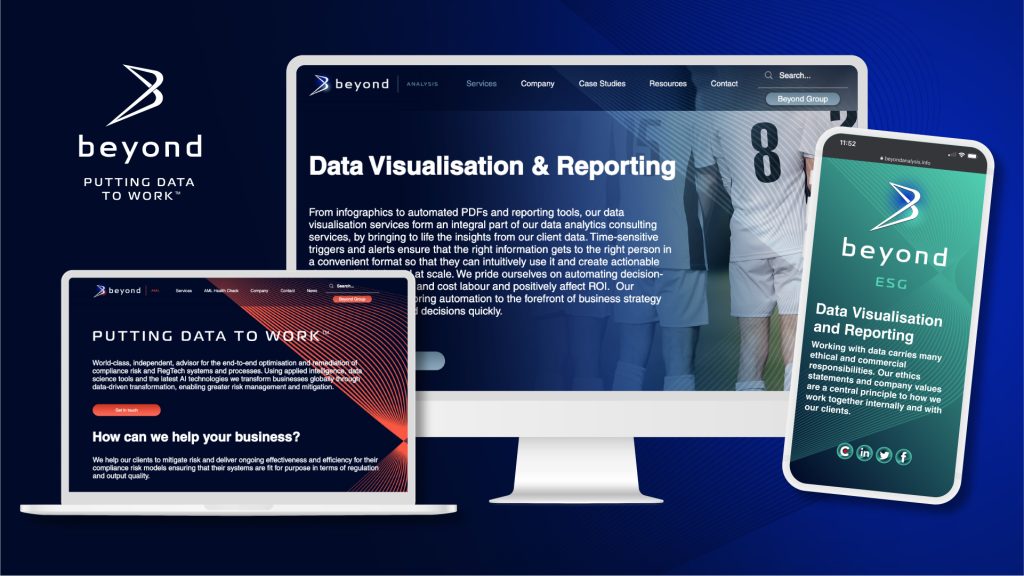
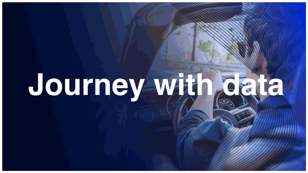
The company’s tagline ‘Putting Data to Work’ represents a humanised action orientated approach to data so imagery used has moved away from ‘under the hood’ digitised data graphics to something that is more real. Using people-centric images overlaid with brand colours emphasises transparent working practices and relationships and the emotional impact of using data to make the world a better place.
This is a rebrand that goes far beyond a contemporisation of a logo – by applying the company’s belief that ‘data reveals where a business is and where it could go’ we created an authentic adaptable signature that symbolises their business growth as much as their client’s.
| Group identity and different variations across the group.
Going ‘Beyond’ both literally as the newly appointed group name, and as an expression for services that exceed client expectation meant the brief for the rebrand was as strategic as it was creative.
Beyond Analysis had become much bigger than just analysis and evolving the brand identity was an opportunity to communicate their growth and aspirations and to appeal to specific audiences in a dynamic and fast paced industry. Inspired by the enthusiasm from the team for their work and continued action towards betterment, ‘Infinity’ became the creative idea that shaped the brand identity.
The symbolic Infinity ‘B’ brandmark – is a dynamically stylised letter ‘B’ that plays on its similarity to the infinity symbol and its representation of limitlessness, the perfect embodiment of Beyond’s endless strive to better businesses. The wordmark has been evolved to reflect the companies’ people-centric expertise, becoming more sophisticated but no less approachable by retaining its lowercase familiarity.
We tweaked the already established company colour palette and chose to look at how we could use the colours differently. We assigned the enriched deep blue as the group corporate colour, using the electric blue to bring depth and contrast. Divisions of the Beyond Group have been given their own accent colour to differentiate the services.
A vertical line serves as a metaphor for division of the group and by adapting the visual hierarchy of words by introducing the company division accent colour we created a flexible and infinite signature system.
The company’s tagline ‘Putting Data to Work’ represents a humanised action orientated approach to data so imagery used has moved away from ‘under the hood’ digitised data graphics to something that is more real. Using people-centric images overlaid with brand colours emphasises transparent working practices and relationships and the emotional impact of using data to make the world a better place.
This is a rebrand that goes far beyond a contemporisation of a logo – by applying the company’s belief that ‘data reveals where a business is and where it could go’ we created an authentic adaptable signature that symbolises their business growth as much as their client’s.