– New branded wine range development – Label design and packaging presentation – Captivating story-led design expression – Unique crafted typography and illustrations
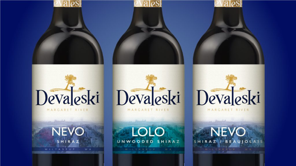
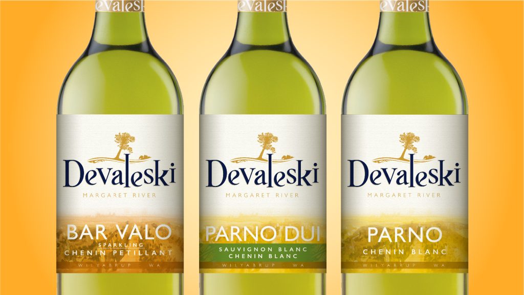
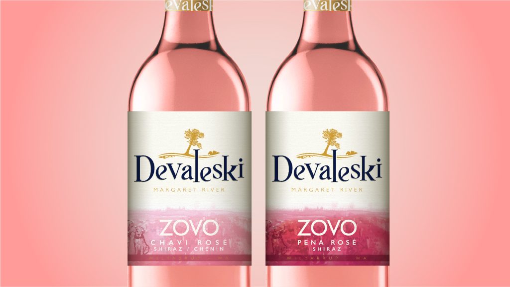
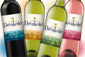
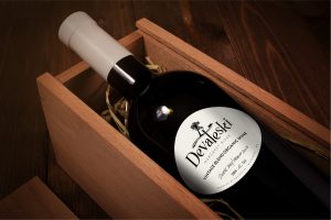
This winery from Margaret River Australia required a unique approach to label design. The winery produces all batch organic wines that are made up of lots of different grape varieties and as such I had to design a label that was infinitely adaptable to a new blends.
The winery is unique in that it is minimal intervention has a bohemian pedigree for producing wines that are uniquely seasonal. The wines are an eclectic blend of Mother Nature, steeped in stories of the land and big ambition to create delicious wines so I wrapped al this up into the label to tell a unique story.
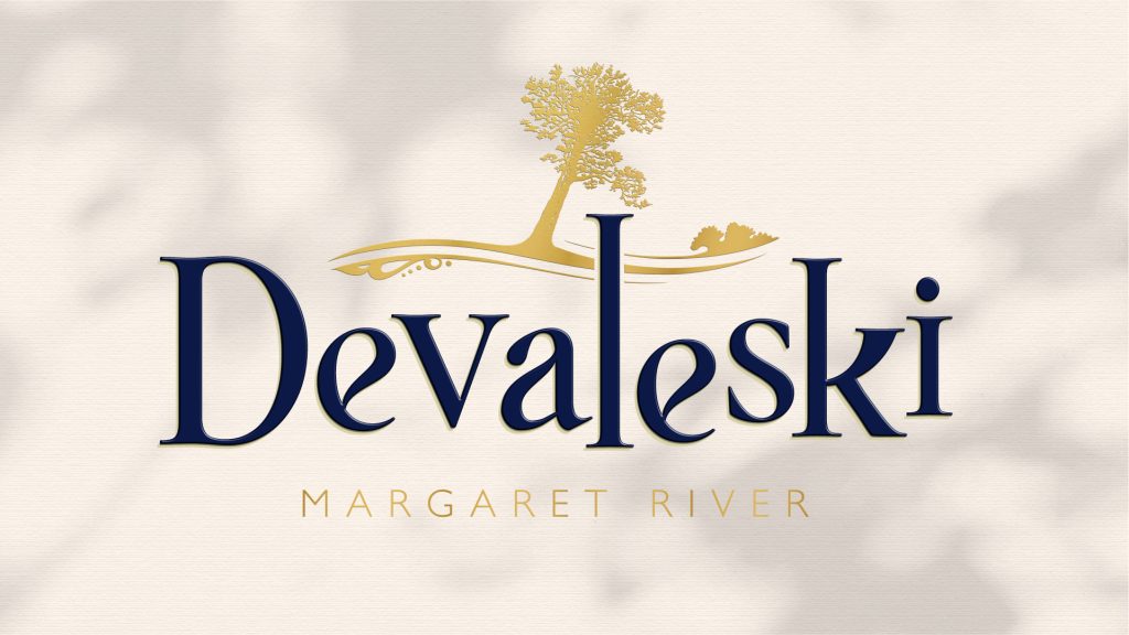
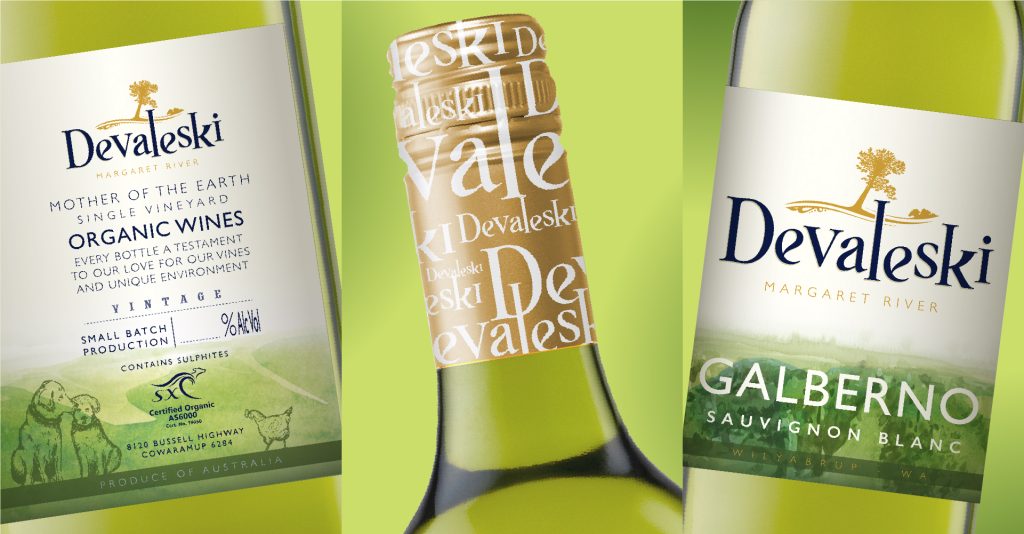
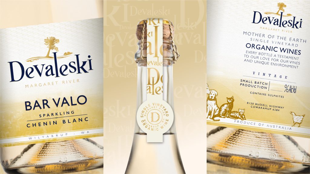
The logo itself represents the individuality of this vineyard – with consistent and yet juxtaposed lettering that sits at the base of the leaning gum tree on the vineyard (caused by and ants nest). Animals and farm are very much part of the story so year on year more dogs, chickens, and more recently cats are welcomed to the Devaleski wine labels.
The names of the wines come from gypsy travellers and add to the eclectic feel of the label designs.
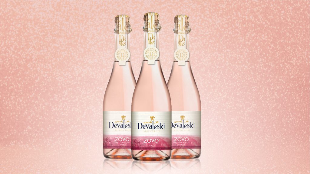
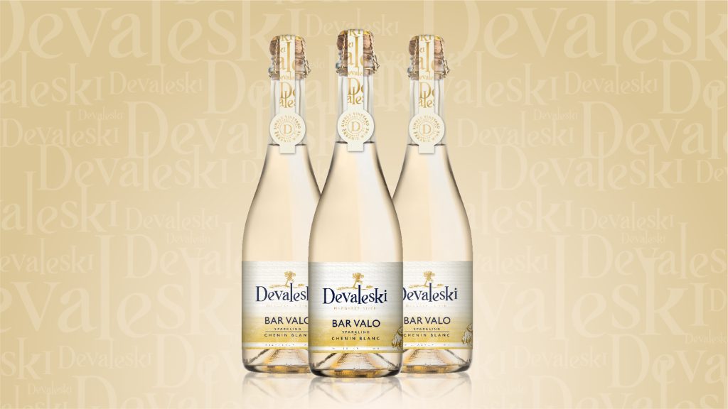
Premium sparkling wines have the addition of an over cap seal and more delicate colour palette.
| Blue selected as the colour variations for red wines.
| Greens and yellow hues selected for white wines.
| Detailed crafting and design for personality and uniqueness.
This winery from Margaret River Australia required a unique approach to label design. The winery produces all batch organic wines that are made up of lots of different grape varieties and as such I had to design a label that was infinitely adaptable to a new blends.
The winery is unique in that it is minimal intervention has a bohemian pedigree for producing wines that are uniquely seasonal. The wines are an eclectic blend of Mother Nature, steeped in stories of the land and big ambition to create delicious wines so I wrapped al this up into the label to tell a unique story.
The logo itself represents the individuality of this vineyard – with consistent and yet juxtaposed lettering that sits at the base of the leaning gum tree on the vineyard (caused by and ants nest). Animals and farm are very much part of the story so year on year more dogs, chickens, and more recently cats are welcomed to the Devaleski wine labels.
The names of the wines come from gypsy travellers and add to the eclectic feel of the label designs.
Premium sparkling wines have the addition of an over cap seal and more delicate colour palette.
| Rosé selection in vibrant pinks.
| Different bottle and extra delicate detailing for premium sparkling wines
| Different bottle and extra delicate details for premium white wines